Charlie and Gladys Posters

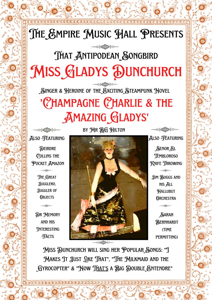
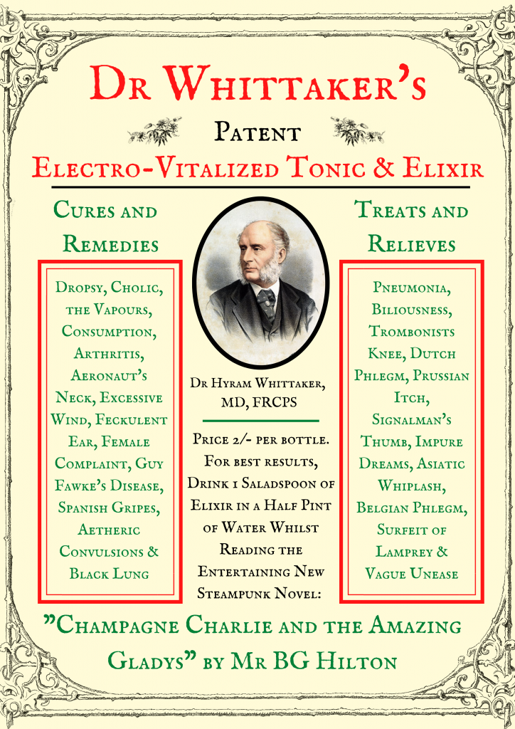
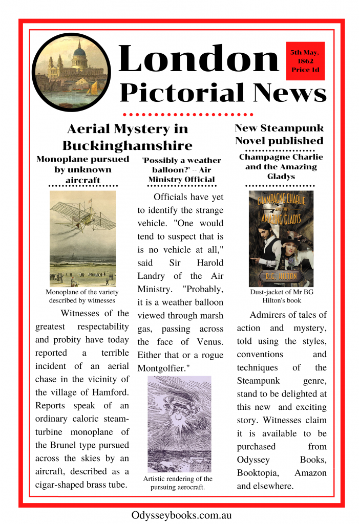
A while back, I made a few faux-Victorian posters to advertise my Steampunk book Champagne Charlie and the Amazing Gladys. Like Steampunk itself, they’re not historically accurate. Posters have been around for a long while, but improved paper production and the introduction of mechanical printing meant they really came into their own as an inexpensive advertising medium in the early 19th Century. However, these were usually very simple affairs, all black or red typeface and the occasional one-colour engraving. Colour printing did exist, but it was expensive, and therefore seldom used on anything as ephemeral as posters.

Colour printing was based on lithography. In very simplified terms, this a system in which a design is drawn onto a flat stone with an oil or wax based media. Ink is then applied, but being water based, it is repelled by the oil. Paper is pressed on this stone, and the ink is transferred. This is repeated several times in different coulours, until the picture is complete. It’s a very beautiful system, allowing a wonderful degree of shade and colour — but it remained uneconomical for poster production until the invention of a three-stone lithographic system in the 1880s. This reduced the cost of number of stones that needed to be prepared to create a colour picture, though it still involved a very strong degree of artistry and craftsmanship to make an image. Frankly, more than it takes for me to knock something out on Canva.

So my images are a bit of a hybrid – massive chunks of black and red typeface like early Victorian posters, but with little elements of colour. Even with the three-colour system, I doubt it would have been economical to have such a small part of the page in full colour. Further, the lithographic process allowed for more interesting text than just blocks of print, which is how you get that elegant lettering of the belle epoque.
But that’s Steampunk, isn’t it? The Victorian era was a period of over sixty years. A Victorian Fantasy often involves collapsing this a little, mixing early- and late- Victorian, sometimes with a bit of Edwardian and Regency for colour. You can find bits of Verne and Austen, Welles and Poe all mixed into a sort of soup. And as long as you know that’s what you’re doing, where’s the harm in that?


